CapitalTime
Articles on investing and capital management, with a quantitative focus.
Backtesting with the Portfolio Visualizer
2019-10-22
One of my favourite investment-related web sites is the Portfolio Visualizer, a collection of analysis tools that can be used to study the behaviour of investment portfolios. (I am not affiliated with the web site; just a fan.)
In this article, I will describe two backtest tools that show historical performance and risk characteristics: Asset Backtest and Asset Class Backtest.
There’s no guarantee that investments will behave like they did in the past, and planning should never rely solely on backtests. At the same time, historical data is all we really have.
Some basics
CAGR = compound annual growth rate, or annual return. For example if $1000 grows at 5% CAGR for 10 years, it becomes: $1000 x 1.05^10 = $1629.
One risk metric that I think is worth paying attention to is the maximum drawdown, the worst case loss from peak to trough. Also see: What is Risk?
Note the effect of inflation. Portfolio Visualizer shows both regular CAGR and inflation adjusted CAGR, also known as the “real return”. The real return can be seen by hovering over the regular CAGR in the report page.
The real return describes how much your money actually grows after inflation is taken into account. Real return = CAGR - inflation rate.
For example if inflation is running at 5%, an investment CAGR of 5% is just keeping up with inflation. The real return would be 0%, not growing in real terms.
Two sample portfolios
To demonstrate the backtests, I’ll use a couple common mutual funds that you might find inside a retirement plan:
Vanguard Balanced Index Admiral (VBIAX) is a standard “balanced fund”, containing 60% stocks and 40% bonds. Due to its stock component, it has the potential to produce high returns, but can also fall significantly along with the stock market.
Vanguard Short-Term Corporate Bond Index Admiral (VSCSX) invests purely in short-term corporate bonds. This is a relatively low risk, low return investment compared to stocks and provides reasonably steady returns.
Using those funds as the building blocks, consider these two portfolios. The first one is fully invested in the balanced fund:
| Portfolio 1 | |
|---|---|
| VBIAX | 100% |
The second one combines the balanced fund and short-term bonds:
| Portfolio 2 | |
|---|---|
| VBIAX | 50% |
| VSCSX | 50% |
I am not recommending these portfolios (I’m not qualified to do so), but the two funds I named are pretty standard.
Let’s study their past behaviour!
Asset Backtest
Using the Asset Backtest tool, you can directly input the portfolios from above using the fund symbols.
Here’s a link to the Visualizer for just Portfolio 1 with the end year set to 2018 so that the numbers remain static after I write this. Scroll down to the Portfolio Analysis Results for this 100% balanced fund portfolio.
You will see a note that the time period was constrained by the available data. The fund’s data goes back to 2001.
I’ve copied some of the critical numbers from the Portfolio Returns table. This includes the real return (inflation adjusted CAGR) which is found by hovering over CAGR.
| Metric | Portfolio 1 |
|---|---|
| CAGR | 5.81% |
| Real return | 3.67% |
| Best Year | 20.11% |
| Worst Year | -22.12% |
| Max Drawdown | -32.45% |
Before taking into account inflation, the CAGR (annual return) was 5.81%. After inflation, the real return was 3.67%. This is actually pretty good for a balanced fund in this timeframe, and certainly better than the typical balanced fund.
The Best and Worst years give you an idea of how dramatically the annual returns can vary.
The Max Drawdown is worth thinking about; this is the greatest % loss you would have experienced at some point. In this case, the investor had a 32% loss during the 2008 market crash. This number correlates with the level of pain that an investor feels; more drawdown = more pain.
It’s one thing to see numbers in a table, but it’s another thing to actually see your hard-earned savings plummet like this. I have met investors over the years who said they can handle drops such as 30% to 50%, but could not handle it when it really happened. The pain or panic can lead to people pulling out money at the worst possible time. Sometimes, the pain is so intense that the person will never invest again.
Another consideration is a person’s time horizon. To ride out such large declines, you need to stay invested very long term. This is not always possible to do in real life. You might want to read my reflections on risk.
How about Portfolio 2?
If you enter the weightings of Portfolio 2, you will see data that only goes back to 2011. These are not meaningful long term results.
Looking at a small number of years will give a limited idea of how a portfolio can behave, and you’re better off using longer time horizons whenever you can. The longer time horizon will cover a wider range of potential outcomes and give you a better sense of what an investment might do.
Many ETFs (exchange-traded funds) and mutual funds have a limited history. However, the Asset Class Backtest provides larger datasets.
Asset Class Backtest
The Asset Class version of the tool can be used to run longer-term tests. Instead of using data for a specific investment (such as VSCSX), this tool uses data for entire investment categories = asset classes.
For example, VSCSX closely tracks the asset class named Fixed Income: Short-Term Investment Grade. You can think of VSCSX as an instance of Short-Term Investment Grade.
Here are Asset Class equivalents of Portfolio 1 and Portfolio 2:
| Asset Class | Portfolio 1 | Portfolio 2 |
|---|---|---|
| US Stock Market | 60% | 30% |
| Total US Bond Market | 40% | 20% |
| Short-Term Investment Grade | 50% |
You can see that Portfolio 1 decomposes into the 60/40 stock and bond mix. Portfolio 2 adds short-term bonds at half weight, retaining the same 60/40 mix in the other half.
We can test the historical results all the way back to 1987, long before either mutual fund existed.
Portfolio Comparison
Here’s a link to the Visualizer for both portfolios based on the asset class view of the same portfolios. Let’s see how they stack up:
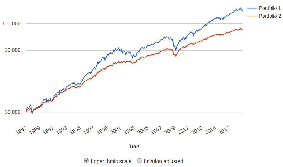
| Metric | Portfolio 1 | Portfolio 2 |
|---|---|---|
| CAGR | 8.53% | 6.90% |
| Real return | 5.78% | 4.19% |
| Best Year | 28.74% | 20.74% |
| Worst Year | -20.20% | -12.47% |
| Max Drawdown | -30.72% | -17.17% |
You might notice that Portfolio 1’s CAGR and Best Year have increased from the previous backtest. This is due to the different start date, since stocks and bonds performed very strongly from 1987-2000. The other metrics are about the same as before.
Here we see that Portfolio 1 outperforms Portfolio 2 by an additional 1.6% CAGR. But also look at the risk measures. Portfolio 2, with the added stability of short-term bonds, does not swing quite so wildly (Best vs Worst).
The worst year on record is now -12%, instead of -20%. And the maximum drawdown is much milder at -17% instead of -31%. That means less stress and regret.
Which portfolio is better?
There is no right answer to this question. Everyone has different risk tolerance and time horizons, so one size does not fit all. Here’s my own reasoning:
Both of these example portfolios have solid real returns, both grow money even after inflation. The performance difference of 1.6% is not as significant as it may seem, because it’s sensitive to the exact start and end dates. For example, both portfolios had about the same performance from 1998 - 2012.
In my view, Portfolio 1 might perform ~ 1% CAGR better. However, this comes with more volatility and sharper drops. I really don’t want to see my retirement savings decline by 1/3, because I think this would be stressful.
I prefer Portfolio 2 because of the “smoother ride”. I think this will be less stressful and easier to stick with, so I’m happy to sacrifice the ~ 1% CAGR.
I’m not even convinced that this is a true sacrifice, once I take into account some caveats of this backtest analysis.
Caveats
The Portfolio Visualizer only has data back to 1972, and some assets don’t even go that far back. Stocks did poorly in the 1910s and 1930s, but this isn’t part of the dataset.
Generally speaking, I think the data since 1972 is reasonably representative of longer-term stock and bond data. However, to get the full picture, you must include the 1970s. This was a high inflation period that was bad for stocks and bad for some kinds of bonds.
Note that the examples above don’t include the 1970s; data wasn’t available for the chosen assets. I think that the available datasets might favour Portfolio 1.
Of course, the biggest caveat of all is that the future may not be a repeat of the past. Investment modeling and portfolio design is a kind of pseudoscience which is probably far more numerical than it should be. All of these numbers imply some level of certainty, but there is no certainty at all.
— Jem Berkes